
Vereinigte Staaten
Growing up, I would drool for hours over the graphics on skateboards in store windows. Two fundamental stepping stones were my first encounter with graffiti when I was still in graphic design school and the calligraphy of the late 90s. It took a very natural course, rich with surprises. At the time, I didn’t think that drawing letters could be a career. I just felt like I had to do it and that was that, because it was something that made me feel good, a sort of meditation. Letters are the codes we use to communicate. A phoneme becomes a graphic sign, and the letter designer’s job is to give those signs form, or to use the right one. As far as appearances go, it might seem like a minor discipline that most people ignore, but everyone benefits from it somehow or another. In a society founded on the image and on communication, letters are fundamental.
HOW IMPORTANT IS THE COMPUTER TO YOUR WORK?
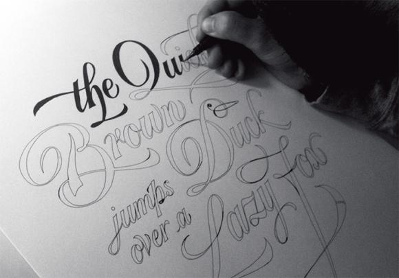
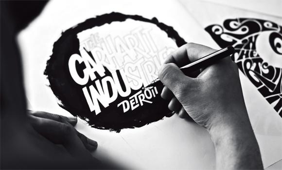
I always try to start with a handwritten layout. I write; I try different tools and different kinds of paper; I draw rough shapes of the letters in pencil. The computer can be really useful by speeding up the steps of the layout process and for trying out different colours. A lot depends on the scope of the lettering you are asked to create. With commercial work, the digitalisation of a calligraphic design isn’t always necessary because the letters may lose their material effect and freshness. Other times, instead, it is necessary and the calligrapher has to know how to use his hands and have control over the shape of the letter being vectorised so that it doesn’t lose its original form and nature. For now, I’m trying to avoid using graphic tablets. I know that I would become terribly lazy with one of those things! I prefer to use paper and ink, to get my hands dirty, even if it might take more time.
WHO USUALLY COMMISSIONS YOUR WORK?
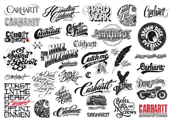
I’m realising more and more that lettering coincides with every field. I work a lot with clothing graphics and logotypes, magazine illustrations and publishing in general, and book and album covers. Lately, I’ve been working a lot with video and animation. Once I collaborated on a publicity spot advertising make-up where I created letters with dirt. I never say no to the more common calligraphy projects, like awards, invitations and diplomas. They can be a little monotonous, but they also guarantee good practice. I don’t like being recognised for one thing in particular because you risk becoming victim to a vicious circle, always finding yourself doing the same things. For this reason I try to be as versatile as possible. I try to know as many writing styles as possible and to make them recognisable as my work, and to propose new things, even if they are personal projects. You have to learn how to tell if you’re being asked to do something artistic in nature or something more graphic or calligraphic. I think this is the most difficult compromise I have to make in my work.
HOW DO YOU DECIDE WHICH PROJECTS TO TAKE?
I try to regard myself as a craftsman, not as an artist. Half of my job consists of explaining what I do, that is, the value of designing letters by hand and the time it takes compared to using fonts and software. Initially, I try to figure out if the project interests me, if it lets me experiment with something new. If I’m asked to do artwork based on something I’ve already done for others, I try to shift the attention elsewhere, even if it’s not always possible. In the end, you have to know how to interpret the needs of your clients. I try to learn if they know my work (some contact me without really knowing what I do!), and then decide whether to pass or move forward with the job.
WHO WOULD YOU SAY ARE YOUR GREATEST INFLUENCES?
After my training writing graffiti – which really is less about actual rules and more of a self-taught, egocentric quest – I moved on to graphic design, typography and traditional calligraphy, where I came to know the styles of classical writing, the key movements and tools. I had great teachers, both directly and indirectly. I remember that your works and the discovery of the Cholo style were among the first to catch my attention. They turned me on to the idea of being able to blend freedom and modernity with tradition. I’ve worked this way for a long time. So, I could cite your paint-brushed letters among my greatest influences just as I could the work of other calligraphers like Rudolf Koch and Hermann Zapf. Twist’s tags in the mid-90s are just as influential as the wonderful writing examples of John Stevens; then there are the illustrations of Alex Trochut and hard-to-find calligraphers like Herman Kilian who experimented with different shapes in lettering very similar to those in writing of the 1950s. It’s a fascinating and infinite world.
LETTERS DESCRIBE LANGUAGE AND LANGUAGE IS CAPABLE OF CREATING NEW CULTURES. HOW DO YOU SEE THE FUNCTION OF LETTERS IN CREATING CULTURE? AND DO YOU THINK THAT NEW TECHNOLOGY WILL MAKE YOUR CRAFT OBSOLETE?
After being drowned in technology and the homogeneity that software provides, it is understandable,even natural, that people return to manual tradition. A lot of people expressly ask me to not use fonts. But it’s hard to predict what will happen. I try to diffuse calligraphy simply by using it and teaching it to others so that it continues to be passed down and understood. There are so many people who are passionate about the world of letters compared to a few years ago. You just have to look in any library at the growing number of books on type design and other related subjects, and the average age of those who attend my classes. They’re all very young and a lot of them come from graffiti backgrounds. I believe that new languages are created spontaneously, by combining our knowledge with the tools of our time.
I HAVE SEEN YOU WRITE “ALPHABET LOVE” ON A WALL. WOULD YOU SAY THAT YOU’RE IN LOVE WITH LETTERS?
Definitely. You can’t dedicate most of your time to something that you don’t truly love. In fact, the other half of my time I spend with my girlfriend and with the people around me who I would give anything to.
WHEN I VISITED YOUR STUDIO IN MILAN, YOU SHOWED ME A FEW CALLIGRAPHY PENS YOU MADE BY HAND. COULD YOU DESCRIBE THE KIND OF TOOLS YOU MAKE AND USE?
Like I said, the right tool for the right goal. I love the flat brush for the twists it allows. It lets you create lively letters. Calligraphy nibs are precise, but they can also be used in a more gestural way, just like the infinite number of tools that can be built by hand or those you find when sifting through stores. For layouts, I use a lot of stylographic pens for calligraphy. They’re really handy. But for final drafts, I use more traditional tools like automatic pens, and I prefer thin tempera and Sumi – a Chinese ink in stick form – to the more common inks.
ARE YOU A PERFECTIONIST?
It’s clear that if you think about every letter and every gesture before writing, you limit the possibility for surprises. Excessive retouching can take away the beauty of a simple gesture, even if it’s imperfect. Once again it depends on the scope of the project, if it’s artistic or commercial. The world of commerce is often ephemeral, superfluous, and planned, and consequently its aesthetic can be as such. It’s a whole other story if we’re talking about a calligraphy piece that will be seen in its original form, with the naked eye on paper. In this case, I wouldn’t advise making corrections because you can see the quality and any error can become an asset. The pen is not forgiving!
THE NEGATIVE SPACES BETWEEN THE LINES AND SHAPES ARE JUST AS IMPORTANT AS THE LETTERS. HOW DO YOU KNOW WHEN THE LETTERS ARE FINISHED AND WELL-PROPORTIONED?
I always trust my eye, even more than I trust geometry. At times, it’s useful to go back to a piece after a few days’ time. It helps me realise immediately if something isn’t right. You can waste so much time and so many reams of paper on a curve that just doesn’t convince you, but that’s the beauty of it!
I HAVE SEEN EXCELLENT CALLIGRAPHY RUINED BY POOR DESIGN CHOICES AND LAYOUT. HOW IMPORTANT IS THE FINAL LAYOUT AND USAGE OF THE LETTERS TO YOU?
Oh, this is so true, and you know it so well! So often companies ask you to do just the logo or just the lettering for a project, while the graphics are entrusted to others who use fonts without consulting you, or use the letters of their liking. What you find then is, for example, that the trademark on a wine bottle label is full of Photoshop effects, or that the lettering on an 80s-style book cover is a done in a wood type from the 30s. I often see fonts that are distorted and rotated, in different colours. Honestly, I even find it a little disrespectful. It’s not just the software’s fault, but also that of marketing, which doesn’t follow any coherent rules of aesthetics, just the logic of sales. The best thing, if it’s possible, is to do the project yourself, to try and give importance to the lettering as an image in its own right, or to entrust the project to someone who has taste and experience.
WE ALL HAVE TO LIVE, BUT HOW DO YOU DIVIDE YOUR TIME BETWEEN COMMERCIAL WORK OF DESIGNING LETTERS AND HAVING ARTISTIC FREEDOM?
It’s extremely difficult to find a balance. I try to find equilibrium between commercial projects, which provide me with a living, and personal projects in which I invest time and energy for that passion that’s so easy to lose when it becomes just another job. So, it’s important to feed that passion with projects that aren’t motivated by money but instead by the simple joy of doing them. It is a necessity! In the past few months, I’ve produced a small line of T-shirts and some advertisements that had hand-printed engravings just to alternate the large amount of work I have in the studio with personal projects – projects that involve other people as well who make you feel happy and gratified. Moreover, there are occasions when you can freely propose your ideas without someone commissioning them, and, in turn, generate new opportunities.
HOW DO YOU SEE YOUR FUTURE?
I think I’ll go get some sushi.
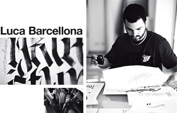
Interview by Chaz Bojórquez
Charles “Chaz” Bojórquez is a legendary urban artist from Los Angeles. He began his art career in the Chicano scene of the late 1960s with urban grafitti and earned a reputation by creating a famous tag – a stylised skull called Señor Suerte (Mr Luck), which has since become a gangster image of protection from death. Bojórquez quit tagging in 1986 and has successfully completed the transition from street to gallery as one of the few artists from his scene. Three of his paintings are now in the collection of the National Museum of American Art in Washington, D.C. Four others are owned by the Orange County Museum of Art and regarded as important examples of Southern California’s culture. In 2010 Carhartt and Damiani published a book about his life and his art. Bojórquez lives in Mt. Washington, California. For the Carhartt brandbook he interviewed Italian lettering artist Luca Barcellona, his friend and collaborator on several calligraphy-related projects.
Pictures: Marco Marzocchi
Taken from Carhartt brandbook Volume 6 available at our online shop, all Carhartt WIP Stores, Carhartt retailers.
More Info: