Estados Unidos
But fear not, the good ol' grimy days have not been forgotten, Carhartt WIP's latest advertising campaign reminds us that the slick fashions are all too easily fucked up.
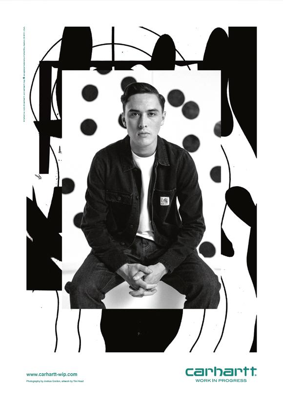
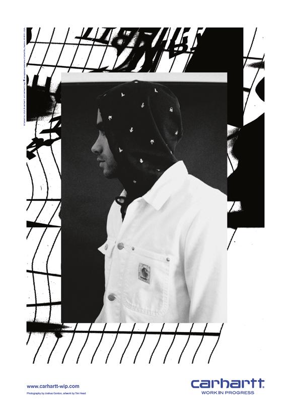
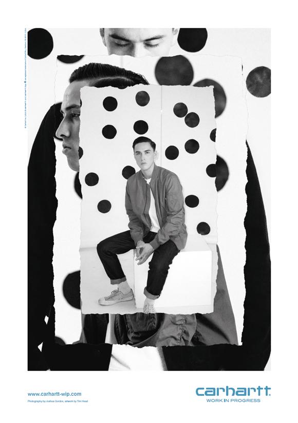
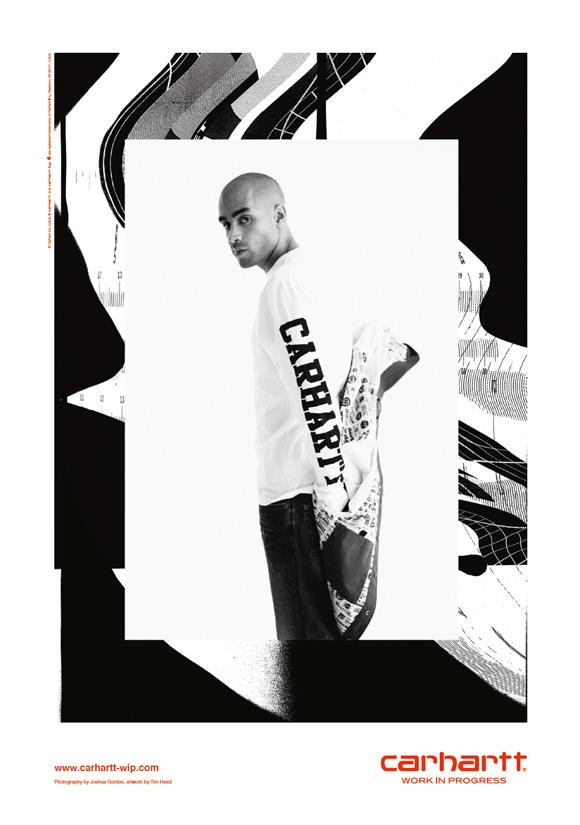
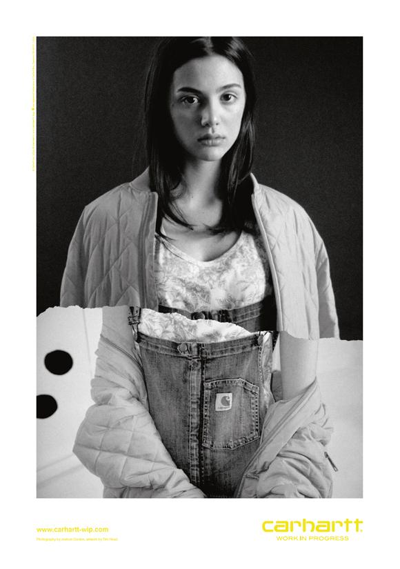
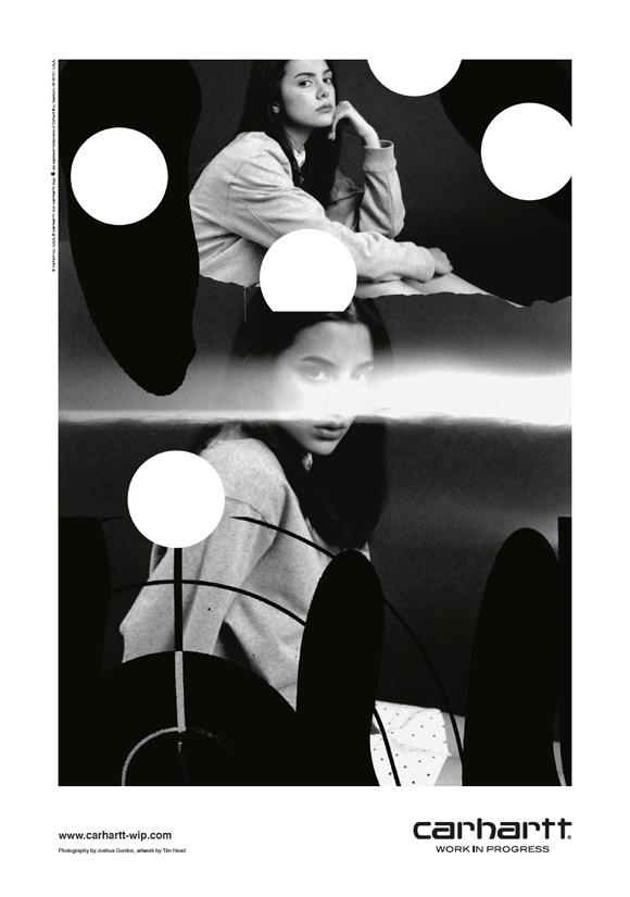
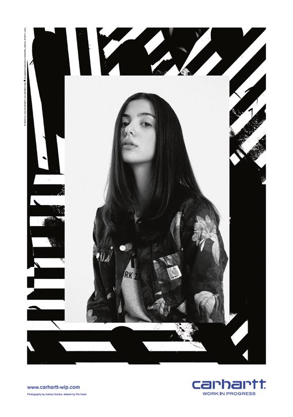
Responsible for the campaign's raw, lo-fi look is photographer, Joshua Gordon and Tim Head, an artist working in miscellaneous mediums and fields including illustration, film, graphic design and the curation of exhibitions and zines.
Both based in London, the duo had collaborated on a set of visual communications for Joshua's Dublin-based brand Filthy Club before they teamed up with Carhartt WIP in 2014. Joshua, who had already shot a series of photos for Carhartt WIP's Brand Book, produced the striking series of grainy black-and-white photographs and Tim gave it that glitchy graphic treatment.
“To me, Joshua's photos are the heart of the campaign.” Tim states. “I didn't want to overbear on them or distract via my design, but to sound out the right balance instead. It is the photos that add the human element and show the most important things in a campaign - the clothing.”
To link his artwork to the collection, Tim sampled some of the season's most characteristic patterns, such as the Distortion and Economy Print. He calls himself “an analogue guy in a digital world” and has created all of the warped visuals by hand, altering printouts on a beaten up photocopier, re-scanning them into a borrowed old laptop as his own had blown up just before the photoshoot.
Having first turned to the technique though lack of digital tools when designing a poster for a London-based psychadelic band during a lunch break at his day job, he has since returned to the photocopier whenever a project has called for it.
For Carhartt WIP's Spring/Summer 2015 campaign, Tim and Joshua made the "Work in Progress" moniker their motto and developed a visual language that clearly marks a return to the company's rough and tough tradition.
One may take the griminess as an homage to Detroit's oil-smudged workshops, or simply see it for what it is: a relevant new direction, driven by a sense of sabotage. “Carhartt WIP needs a pat on the back for being brave enough to let us go for that,” Tim says. “Many other companies would have played it safe, but their comment when we submitted our designs drafts was ‘make it dirtier.’ - Which of course I could do!”
Dirt and disturbance can imbue images with depth and to quote Joshua quoting Andreas Feininger: “The fact that a (in the traditional sense) technically deficient photograph can have greater emotional impact than a technically flawless picture probably comes as a shock to those who are naive enough to believe that technical excellence alone is a measure of a value of a photograph".
Tim: “We were striving for something that even if people liked it or loathed it, they couldn't ignore. It's a new direction for the brand in terms of their identity”. Joshua adds, “I think our visual language brings the brand back to an earlier time when things were a bit more free, impulsive and maybe more erratic. But it’s only the start really. We don't want this to be a singular shoot and are already planning what's next, what films we can make, what photographs we can take."
Joshua recently relocated from Dublin to London and he is now, amongst other things, working on a show with Craig Boagey and trying to get funding for a documentary photo book he shot in Thailand. Tim has just moved studios and is currently busy creating visuals for a friends bar, gathering graphics to submit for Tokyo-based brand AFour and putting together a small book of his own sketches and photos.
The video campaign to accompany Carhartt WIP's Spring/Summer 2015 collection, featuring Jerome Campbell is also in the works and will be out in March.